Simple.io
A discovery-led redesign that helped an Australian SaaS platform cut through conservative branding, find its personality, and lift website leads by 26%.


Making SaaS distinctive + memorable.
The client
Simple.io is an Australian-based marketing technology company that provides a cloud-based Marketing Operations Management platform. They help enterprise marketing teams, creative agencies, and retail brands streamline their marketing lifecycle, from initial planning and briefing through to final asset approval and storage. Their client list includes household names like RACV, Woolworths, Hesta, Bendigo Bank, and NIB.
The problem
Simple had a strong product and a strong client base, but their website was holding them back. Overloaded with information and difficult to navigate, the site made the user journey feel unnecessarily complex. Visitors struggled to find the calls-to-action they needed, and the site wasn't converting traffic into the demos and leads the sales team depended on. For a SaaS business where the website is the primary sales engine, underperformance wasn't only a design problem. It was a revenue problem.
The approach
We started with discovery and market research to understand how Simple's audience was navigating the existing site, where they were dropping off, and what was getting in the way of conversion. That research shaped both the structure and the personality of the new site.
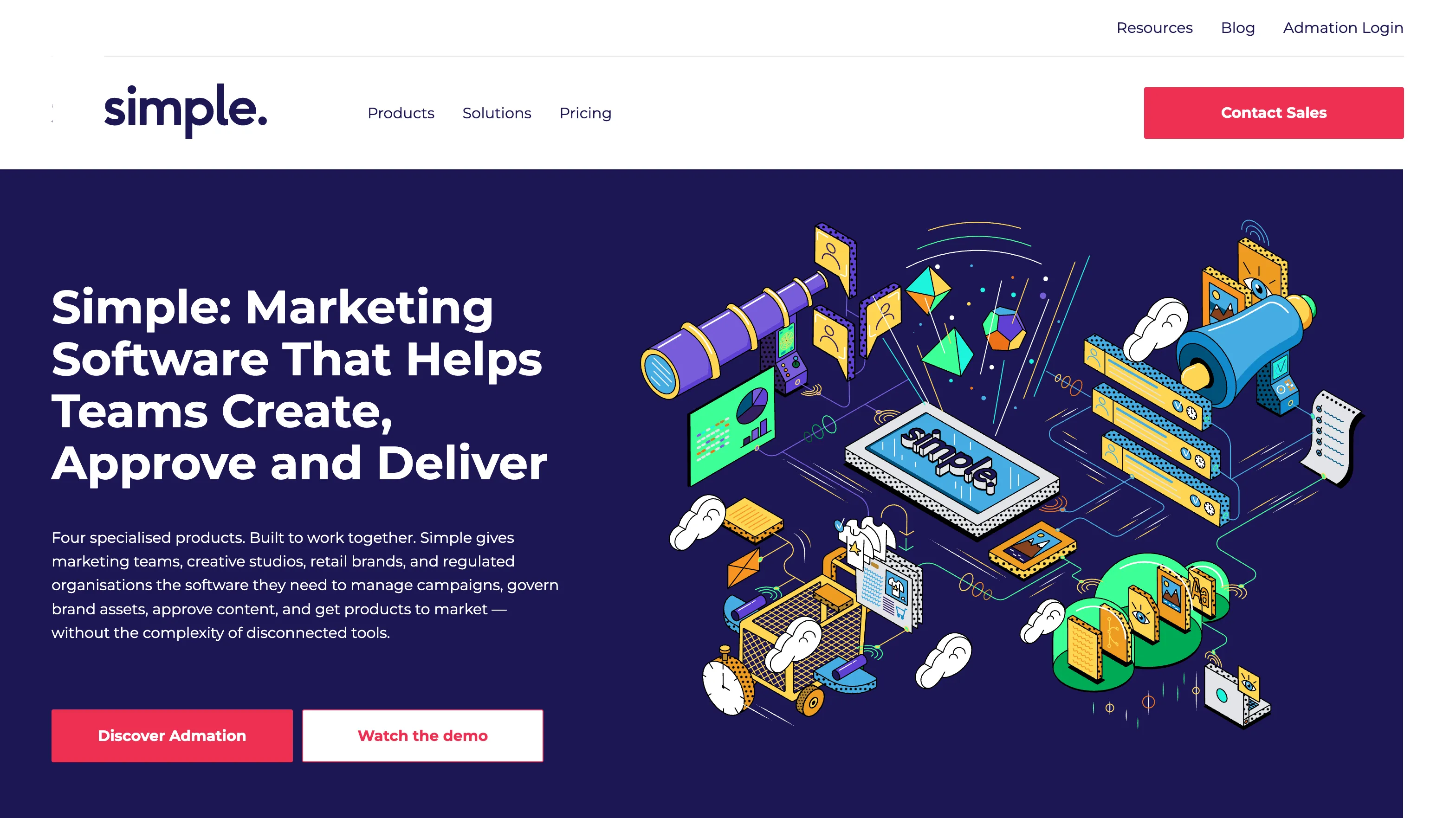
One of the most significant outcomes of discovery was a shift in creative direction. Simple's existing branding was conservative and corporate: functional, but forgettable in a crowded market. Through the discovery process, we made the case for introducing a distinctive illustration-led visual language that would give the brand personality and warmth without undermining its enterprise credibility. It was a conversation that required trust on both sides. The client needed convincing, and we needed to demonstrate that standing out would serve them better than blending in.
The solution
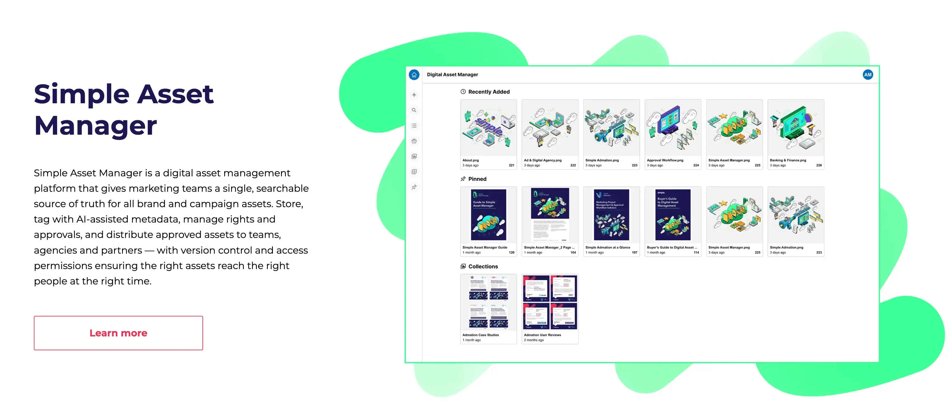
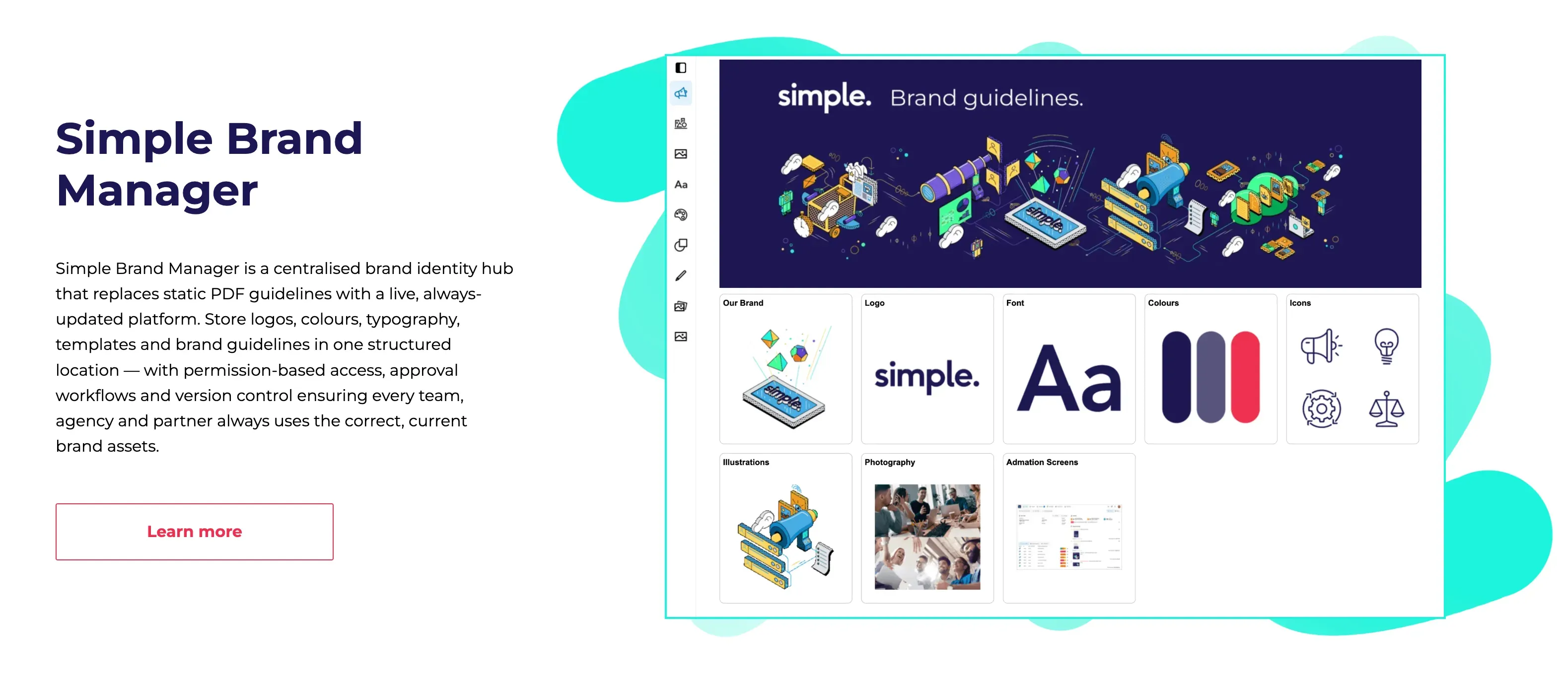
We redesigned the full website with a streamlined structure built around a single clear goal: getting the right visitors to the right information and making it easy to book a demo. CTAs were placed where they made sense within the user's journey rather than interrupting it. Each product area was given clear, focused messaging so visitors could quickly understand what was relevant to them.
Mid-project, Simple restructured some of their service offerings, which meant revisiting the site architecture and messaging we'd already built. We adapted quickly, reshaping the structure to reflect the new direction without losing momentum or compromising the quality of the final result.
The results
The impact on Simple's lead generation was immediate:
26% increase in website leads
More visitors converting into demo bookings + sales conversations
76% increase in average time on site
Visitors engaging more deeply with the content rather than bouncing
Distinctive, illustration-led brand
An identity that set Simple apart from competitors in a conservative category
Streamlined site structure
that made it easy for enterprise buyers to find the product information they needed
For a SaaS business competing for enterprise attention, a website that generates 26% more leads is a direct contribution to revenue.